This notebook is to demonstrate how I have used Neo and EFEL packages to visualize and analyze whole-cell electrophysiology data. This was one of the first scientific problems that showed me how python could speed up my required analysis for my research project.
import efel
import numpy as np
import matplotlib.pyplot as plt
import neo
import pandas as pd
import glob
from scipy.optimize import curve_fit
from scipy import stats
%matplotlib inline
Representing experiment files in python
First, I want to create a list of the the recording data files which are in a directory based on the experiment conducted.
recording_list = glob.glob('../data/iclamp/examples/*.abf')
Neo has many different IO classes for reading various electrophysiology data formats.
def read_recording(file):
    """Provide filename and converts recording from Axon's .abf
    fileformat into a neo object"""
    reader = neo.io.AxonIO(filename=file)
    block = reader.read_block(cascade=True, lazy=False)
    return block

block = read_recording(recording_list[0])
len(block.segments)
25
In these experiments, each recording from a neuron is represented as a block with multiple segments. Each segment has a corresponding analogsignal which was recorded with a different stimulus intensity (100 pA current steps for 100 ms).
block.segments[0]
Segment with 1 analogs, 1 event arrays
# Analog signals (N=1)
0: AnalogSignal in 1.0 mV with 12500 float32 values
   name: 'IN 1'
   channel index: 1
   sampling rate: 50000.0 Hz
   time: 0.0 s to 0.25 s
Visualizing intracellular recordings
In order to visualize a complete single neuron recording, I overlay each recorded analogsignal on the same temporal axis.
def plot_block(block, step=1):
    """plots all traces/analogsignals from a single recording/block"""
    fig, ax = plt.subplots()

    for seg in block.segments[::step]:
        timecourse = seg.analogsignals[0].times - seg.analogsignals[0].t_start
        timecourse = timecourse.rescale('ms')
        ax.plot(timecourse, seg.analogsignals[0])
        ax.set_xlabel('time (ms)')
        ax.set_ylabel('mV')
        ax.plot(timecourse, seg.analogsignals[0])

plot_block(block)
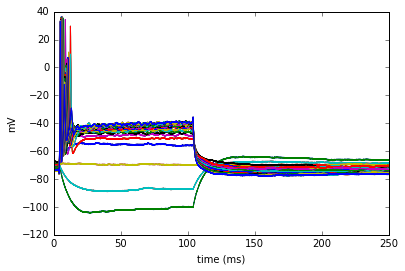
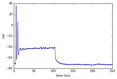
It's hard to distinguish each individual trace if I plot them on top of each other, so I can plot a single trace or a matrix like series of all the traces to visualize them all together at once.
def plot_trace(segment, features=None):
    """plots a single trace (segment.analogsignal)"""
    fig, ax = plt.subplots()
    timecourse = segment.analogsignals[0].times - segment.analogsignals[0].t_start
    timecourse = timecourse.rescale('ms')
    ax.set_xlabel('time (ms)')
    ax.set_ylabel('mV')
    ax.plot(timecourse, segment.analogsignals[0])
    #ax.plot
    return ax

plot_trace(block.segments[12])
<matplotlib.axes._subplots.AxesSubplot at 0x7fccaa325a50>
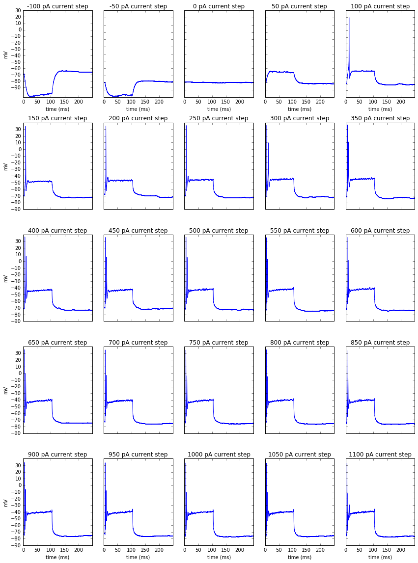
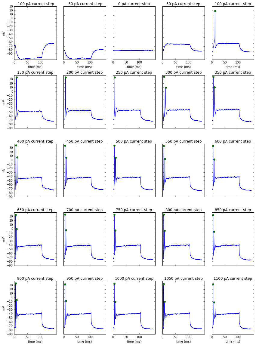
def plot_recordings(block):
    plt.figure(figsize=(12, 16))
    stimulus_range = range(-100, 1150, 50)

    for plot_num, seg in enumerate(block.segments):
        ax = plt.subplot(5, 5, plot_num + 1)

        timecourse = seg.analogsignals[0].times - seg.analogsignals[0].t_start
        timecourse = timecourse.rescale('ms')
        plt.plot(timecourse, seg.analogsignals[0])
        plt.title('{} pA current step'.format(stimulus_range[plot_num]))

        if plot_num % 5 == 0:
            plt.yticks(np.arange(-90, 40, 10), fontsize=10)
            ax.set_ylabel('mV')
        else:
            plt.yticks(np.arange(-90, 40, 10), [''])

        if plot_num <= 4 or plot_num >= 20:
            plt.xticks(np.arange(0, 250, 50), fontsize=10)
            ax.set_xlabel('time (ms)')
        else:
            plt.xticks(np.arange(0, 250, 50), [''])

    plt.tight_layout()

plot_recordings(block)
Extracting spike features
To analyze these recordings I use a library called the Electrophys Feature Extraction Library (eFEL). This package allows me to extract specific features of from experimental or model generated recordings.
In this example I will identify each spike that occurs within the stimulus period and plot a marker on the peak of the spike.
def build_efel_traces(block):
    """takes a block and returns a list of trace dicts which contain necessary information for efel feature
       extraction (time, voltage, stim_start and stim_end)"""
    efel_traces=[]
    for seg in block.segments:
        time=seg.analogsignals[0].times-seg.analogsignals[0].t_start
        time=time.rescale('ms')
        voltage=seg.analogsignals[0]
        stim_start = 1
        stim_end = 100
        efel_traces.append({'T': time, 'V': voltage, 'stim_start': [stim_start], 'stim_end': [stim_end]})
    return efel_traces
def get_spike_features(block):
    """takes a recording block and returns a list of dicts (one for each segment)
    with extracted features for each segment"""
    traces = build_efel_traces(block)
    features = efel.getFeatureValues(traces, ['Spikecount','peak_time', 'peak_voltage'])
    return features
features = get_spike_features(block)
The features list contains dicts with the extracted features for each segment. For example, the last segment here had 3 spikes.
features[24]
{'Spikecount': array([2]),
 'peak_time': array([ 4.9,  8. ]),
 'peak_voltage': array([ 31.7993145, -12.2070303])}
Now I can create a plot_spikes() function by modifying the plot_recordings function to take in the features list.
def plot_spikes(block, features):
    """The features list should contain the peak times and peak voltages of each extracted spike and will
       plot markers at spike peak time for those counted in addition to all traces/analogsignals
       from a single recording/block."""

    stimulus_range = range(-100, 1150, 50)
    plt.figure(figsize=(12, 16))

    traces = build_efel_traces(block)

    for plot_num, (seg, feats) in enumerate(zip(block.segments, features)):
        ax = plt.subplot(5, 5, plot_num + 1)
        timecourse = seg.analogsignals[0].times - seg.analogsignals[0].t_start
        timecourse = timecourse.rescale('ms')
        plt.plot(timecourse[:7500], seg.analogsignals[0][:7500])
        plt.title('{} pA current step'.format(stimulus_range[plot_num]))

        peak_time, peak_voltage = feats['peak_time'], feats['peak_voltage']
            #peak time is in seconds, divide by 1000 so its in ms
        if feats['peak_time'].size != 0 and feats['peak_voltage'] is not None:
            ax.plot(peak_time, peak_voltage, 'o')

        if plot_num % 5 == 0:
            plt.yticks(np.arange(-90, 40, 10), fontsize=10)
            ax.set_ylabel('mV')
        else:
            plt.yticks(np.arange(-90, 40, 10), [''])

        if plot_num <= 4 or plot_num >= 20:
            plt.xticks(np.arange(0, 150, 50), fontsize=10)
            ax.set_xlabel('time (ms)')
        else:
            plt.xticks(np.arange(0, 150, 50), [''])

    plt.tight_layout()
plot_spikes(block, features)
Processing a list of recordings
Now that we can extract features from a recording and visualize them to make sure it's doing what we expect, we can put it in a function to extract all the features from a list of recordings.
def process_recording_list(recording_list):
    """takes a list of recordings names and returns a dictionary with
       filename as key and a list of spikenumbers as value"""

    spike_dict = {}
    for recording in recording_list:
        block = read_recording(recording)
        recording_features = get_spike_features(block)

        step_list=[]
        for current_step in recording_features:
            step_list.append(int(current_step['Spikecount']))

        spike_dict[block.file_origin] = step_list

    return spike_dict
spike_dict = process_recording_list(recording_list)
stim_values = range(-100, 1101, 50)
df = pd.DataFrame(spike_dict, index=stim_values).T
df
| -100 | -50 | 0 | 50 | 100 | 150 | 200 | 250 | 300 | 350 | ... | 650 | 700 | 750 | 800 | 850 | 900 | 950 | 1000 | 1050 | 1100 | |
|---|---|---|---|---|---|---|---|---|---|---|---|---|---|---|---|---|---|---|---|---|---|
| 2013_02_15_0000.abf | 0 | 0 | 0 | 0 | 0 | 1 | 1 | 2 | 2 | 4 | ... | 6 | 5 | 5 | 6 | 6 | 5 | 5 | 5 | 4 | 4 |
| 2013_02_19_0043.abf | 0 | 0 | 0 | 0 | 0 | 1 | 1 | 2 | 2 | 3 | ... | 4 | 3 | 3 | 3 | 3 | 3 | 3 | 3 | 3 | 2 |
| 2013_03_06_0000.abf | 0 | 0 | 0 | 0 | 1 | 1 | 4 | 5 | 8 | 7 | ... | 3 | 3 | 3 | 3 | 2 | 2 | 2 | 2 | 2 | 2 |
| 2013_03_08_0005.abf | 0 | 0 | 0 | 0 | 0 | 1 | 1 | 1 | 1 | 1 | ... | 2 | 2 | 2 | 2 | 2 | 2 | 2 | 3 | 2 | 2 |
| 2013_04_10_0000.abf | 0 | 0 | 0 | 0 | 0 | 1 | 1 | 1 | 1 | 1 | ... | 2 | 2 | 3 | 2 | 3 | 3 | 3 | 2 | 2 | 2 |
| 2013_04_10_0003.abf | 0 | 0 | 0 | 0 | 1 | 1 | 1 | 1 | 2 | 2 | ... | 2 | 2 | 2 | 2 | 2 | 2 | 2 | 2 | 2 | 2 |
| 2013_04_10_0006.abf | 0 | 0 | 0 | 0 | 0 | 1 | 1 | 2 | 3 | 4 | ... | 8 | 8 | 7 | 8 | 7 | 5 | 6 | 6 | 7 | 19 |
| 2013_04_10_0014.abf | 0 | 0 | 0 | 0 | 0 | 1 | 1 | 2 | 2 | 3 | ... | 4 | 3 | 3 | 3 | 2 | 3 | 2 | 2 | 2 | 2 |
| 2013_04_11_0000.abf | 0 | 0 | 0 | 0 | 0 | 1 | 1 | 1 | 3 | 3 | ... | 3 | 2 | 2 | 2 | 2 | 2 | 2 | 2 | 2 | 2 |
9 rows × 25 columns
Fitting a sigmoid function to spike output data
We want to fit a sigmoidal function to the output of each cell.
First define the function:
def sigmoid(x, a, x0, k):
     y = a / (1 + np.exp((x0-x)/k))
     return y
def fit_sig(dataseries):
    """fits a sigmoid function to a series of data points.
       Returns a set of 3 parameters to define the function."""

    a = dataseries.max()-2
    x0 = 400
    k = 50
    guess = (a,x0,k)

    popt, pcov = curve_fit(sigmoid, dataseries.index, dataseries,
                           guess, maxfev=2500)
    return popt
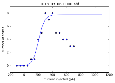
Then we want to see how that function represents our data so we plot it on top of the plot with spike number vs injected current:
dataseries = df.loc['2013_03_06_0000.abf']
single_cell_fit = fit_sig(dataseries)
X = dataseries.index[:17]
y = dataseries[:17]

y_fits = sigmoid(X, *single_cell_fit)

plt.scatter(dataseries.index[:17], dataseries[:17])
plt.plot(X, y_fits)
plt.xlabel('Current injected (pA)')
plt.ylabel('Number of spikes')
plt.title('Poor fit')
<matplotlib.text.Text at 0x7fcca9bd3610>
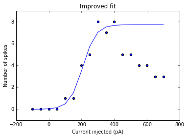
This is an example of a poor fit, where the points with larger amount of current injected and small number of spikes are weighted too heavily. We are most interested in the activating function before the input/output levels are saturated, so we change the function as such:
def fit_sig(dataseries):
    """fits a sigmoid function to a series of data points.
       Returns a set of 3 parameters to define the function."""

    a = dataseries.max()-2
    x0 = 400
    k = 50
    guess = (a,x0,k)

    #the function is fit up to the point of max output level + 1 more step
    y_max = dataseries.idxmax()+50
    x_max  = len(dataseries.loc[:y_max])

    popt, pcov = curve_fit(sigmoid, dataseries.index[:x_max],
                           dataseries.loc[:y_max], guess, maxfev=16000)
    return popt
single_cell_fit = fit_sig(dataseries)
X = dataseries.index[:17]
y = dataseries[:17]

y_fits = sigmoid(X, *single_cell_fit)

plt.scatter(dataseries.index[:17], dataseries[:17])
plt.plot(X, y_fits)
plt.xlabel('Current injected (pA)')
plt.ylabel('Number of spikes')
plt.title('Improved fit')
<matplotlib.text.Text at 0x7fcca961ae10>
As a sanity check, we can plot the fits for each of the neurons in the list of recordings.
for i, row in df.iterrows():
    fig = plt.figure()
    ax = fig.add_subplot()
    fits = fit_sig(row)
    x = row
    y_values = sigmoid(x.index, *fits)
    plt.scatter(df.columns[:17], row[:17])
    plt.plot(x.index, y_values)
    plt.xlabel('Current injected (pA)')
    plt.ylabel('Number of spikes')
    plt.title(i)
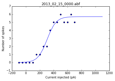
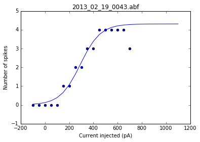
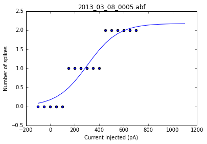
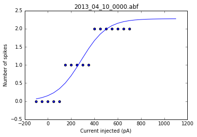
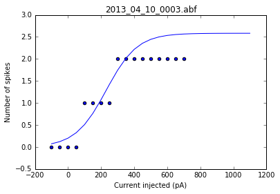
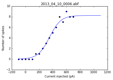
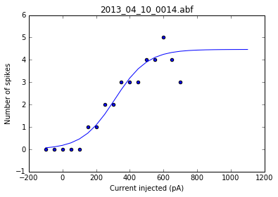
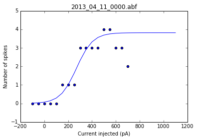
Once we've determined that those fits are satisfactory, we can apply the fitting function to each recording in the dataframe and get a resulting dataframe of the fit values for each neuron.
def fit_dataframe(df):
    """Takes a dataframe of spike counts per current step as parameter.
       Fits a sigmoidal function for each neuron recording and returns
       a dataframe with fit parameters for each neuron recording. """
    result = pd.DataFrame()
    for i, row in df.iterrows():
        fit_values = fit_sig(row)
        frames = [result, pd.DataFrame(fit_values)]
        result = pd.concat(frames,axis=1)
    result.columns = df.index
    return result.T.rename(columns={0: 'a', 1: 'x0', 2: 'k'})
fits_df = fit_dataframe(df)
fits_df
| a | x0 | k | |
|---|---|---|---|
| 2013_02_15_0000.abf | 5.702951 | 304.418502 | 64.675765 |
| 2013_02_19_0043.abf | 4.307646 | 291.948754 | 82.887837 |
| 2013_03_06_0000.abf | 7.720273 | 207.414223 | 39.948745 |
| 2013_03_08_0005.abf | 2.173899 | 304.535559 | 125.139246 |
| 2013_04_10_0000.abf | 2.273765 | 288.213602 | 109.743930 |
| 2013_04_10_0003.abf | 2.583458 | 231.417318 | 93.624331 |
| 2013_04_10_0006.abf | 8.240112 | 351.781098 | 81.572626 |
| 2013_04_10_0014.abf | 4.465958 | 310.926909 | 97.424697 |
| 2013_04_11_0000.abf | 3.814719 | 270.552561 | 67.999466 |
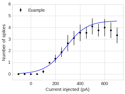
Final plot: putting it all together
Requires: - the average of the points at each current step - the y std error - the mean fit values
def plot_data(analysis_df, fit_df, colour='black', label=None):
    a_mean = fit_df.a.mean()
    x0_mean = fit_df.x0.mean()
    k_mean = fit_df.k.mean()
    popt = (a_mean,x0_mean,k_mean)

    y_err = stats.sem(analysis_df)

    x = np.linspace(-100,700,100)
    y = sigmoid(x,*popt)

    plt.errorbar(analysis_df.columns[:17], analysis_df.mean()[:17], yerr=y_err[:17], fmt='o', c=colour, label=label)
    plt.xlim(-150, 750)
    plt.ylim(-0.5, 6)
    plt.xlabel('Current injected (pA)')
    plt.ylabel('Number of spikes')
    plt.plot(x,y, c='blue')
    plt.legend(loc=2)
fits_df
| a | x0 | k | |
|---|---|---|---|
| 2013_02_15_0000.abf | 5.702951 | 304.418502 | 64.675765 |
| 2013_02_19_0043.abf | 4.307646 | 291.948754 | 82.887837 |
| 2013_03_06_0000.abf | 7.720273 | 207.414223 | 39.948745 |
| 2013_03_08_0005.abf | 2.173899 | 304.535559 | 125.139246 |
| 2013_04_10_0000.abf | 2.273765 | 288.213602 | 109.743930 |
| 2013_04_10_0003.abf | 2.583458 | 231.417318 | 93.624331 |
| 2013_04_10_0006.abf | 8.240112 | 351.781098 | 81.572626 |
| 2013_04_10_0014.abf | 4.465958 | 310.926909 | 97.424697 |
| 2013_04_11_0000.abf | 3.814719 | 270.552561 | 67.999466 |
import seaborn as sns
sns.set_style('whitegrid')
sns.set_context('paper', font_scale=1.75)
plot_data(df, fits_df, label='Example')