Background
This notebook is the result of some exploration and analysis that took place at the Toronto Public Library TOProsperity hackathon.
The challenge for the day was: How can we use information from annual tax records to better understand patterns of income across neighbourhoods in Toronto?
The data used was T1FF Neighbourhood Income and Demographics Tables, by Neighbourhood.
More info can be found at the following links:
I chose to map out the economic dependency ratio by neighbourhood since it seemed to a tractable task for the day and could provide a good overview of earned income as compared to social benefits received.
- Economic Dependency Ratio (EDR):
Is the sum of transfer payment dollars received as benefits in a given area, compared to every $100 of employment income for that same area. For example, where a table shows an Employment Insurance (EI) dependency ratio of 4.69, it means that $4.69 in EI benefits were received for every $100 of employment income for the area.
Explore and clean the CRA data from the T1FF data
import pandas as pd
import numpy as np
import geopandas as gpd
import matplotlib.pyplot as plt
import seaborn as sns
import pysal as ps
%matplotlib inline
df = pd.read_csv('./data/T1FF-F2010-2014.csv', low_memory=False)
subset = df[(df.Year == '2012') & (df.Table.isin(['F-7','F-8'])) & (df.Attribute.str.contains('EDR'))]
#creating 2 subsets of data from CRA, those for Couple families (table F7) and those from lone parent families (table F8)
CF_subset = df[(df.Year == '2014') & (df.Table.isin(['F-7'])) & (df.Attribute.str.contains('· Government transfers · EDR'))]
LP_subset = df[(df.Year == '2014') & (df.Table.isin(['F-8'])) & (df.Attribute.str.contains('· Government transfers · EDR'))]
CF_subset.Attribute.unique()
array(['Couple families · Government transfers · EDR',
       'Male Partners in Couple Families · Government transfers · EDR',
       'Female Partners in Couple Families · Government transfers · EDR',
       'Children in CFF · Government transfers · EDR',
       'All persons · Government transfers · EDR'], dtype=object)
LP_subset.Attribute.unique()
array(['Lone-parent families · Government transfers · EDR',
       'Parents in LPF · Government transfers · EDR',
       'Children in LPF · Government transfers · EDR',
       'Non-family persons · Government transfers · EDR',
       'All persons · Government transfers · EDR'], dtype=object)
CF_subset = CF_subset.drop(['Year', 'Table'], axis=1)
LP_subset = LP_subset.drop(['Year', 'Table'], axis=1)
long_EDR_CF = CF_subset.T
long_EDR_LP = LP_subset.T
long_EDR_CF.columns = long_EDR_CF.loc['Attribute']
long_EDR_LP.columns = long_EDR_LP.loc['Attribute']
long_EDR_CF.drop(['Attribute'], inplace=True)
long_EDR_LP.drop(['Attribute'], inplace=True)
long_EDR_CF.reset_index(inplace=True)
long_EDR_CF.rename(columns={'index': 'neighbourhood'}, inplace=True)

long_EDR_LP.reset_index(inplace=True)
long_EDR_LP.rename(columns={'index': 'neighbourhood'}, inplace=True)
long_EDR_CF.head(3)
| Attribute | neighbourhood | Couple families · Government transfers · EDR | Male Partners in Couple Families · Government transfers · EDR | Female Partners in Couple Families · Government transfers · EDR | Children in CFF · Government transfers · EDR | All persons · Government transfers · EDR |
|---|---|---|---|---|---|---|
| 0 | Agincourt North | 21.9 | 20.2 | 33 | 5.4 | 26.8 |
| 1 | Agincourt South-Malvern West | 19.6 | 18.5 | 28.4 | 5.2 | 24.1 |
| 2 | Alderwood | 11.5 | 10.7 | 14.1 | 6.2 | 16 |
total = long_EDR_CF.merge(long_EDR_LP[['neighbourhood', 'Lone-parent families · Government transfers · EDR']], on='neighbourhood')
cols = ['neighbourhood', 'Couple families · Government transfers · EDR',
        'Lone-parent families · Government transfers · EDR', 'All persons · Government transfers · EDR']
EDR_df = total[cols]
EDR_df.head(2)
| Attribute | neighbourhood | Couple families · Government transfers · EDR | Lone-parent families · Government transfers · EDR | All persons · Government transfers · EDR |
|---|---|---|---|---|
| 0 | Agincourt North | 21.9 | 35.1 | 26.8 |
| 1 | Agincourt South-Malvern West | 19.6 | 37 | 24.1 |
cols = {'Couple families · Government transfers · EDR': 'couple_fam',
        'Lone-parent families · Government transfers · EDR': 'lone_parent',
        'All persons · Government transfers · EDR': 'all_persons'}

EDR_df.rename(columns=cols, inplace=True)
EDR_df.head()
| Attribute | neighbourhood | couple_fam | lone_parent | all_persons |
|---|---|---|---|---|
| 0 | Agincourt North | 21.9 | 35.1 | 26.8 |
| 1 | Agincourt South-Malvern West | 19.6 | 37 | 24.1 |
| 2 | Alderwood | 11.5 | 26.1 | 16 |
| 3 | Annex | 5.2 | 13.2 | 7.7 |
| 4 | Banbury-Don Mills | 11.3 | 21.6 | 15.8 |
Clean and merge the EDR data with Toronto neighbourhoods geometries
gdf = gpd.read_file('./data/neighbourhoods_shp/')
gdf.head(2)
| AREA_NAME | AREA_S_CD | geometry | |
|---|---|---|---|
| 0 | Yonge-St.Clair (97) | 097 | POLYGON ((-79.39119482700001 43.681081124, -79... |
| 1 | York University Heights (27) | 027 | POLYGON ((-79.505287916 43.759873494, -79.5048... |
- To merge the spatial and EDR data, first clean the neighbourhood names so you can do a merge on that column
neighbourhood = gdf['AREA_NAME'].str.replace(r"\(.*\)","")
gdf['neighbourhood'] = neighbourhood.str.strip()
gdf.drop(['AREA_NAME', 'AREA_S_CD'], axis=1, inplace=True)
- An inconsistency I've found is that not all neighbourhood names are the same in both the CRA data and the geometries shapefile for the city neighbourhoods. More cleaning is needed.
EDR_neigh = set(EDR_df.neighbourhood)
gdf_neigh = set(gdf.neighbourhood)

print('diff1: ', EDR_neigh - gdf_neigh)
print()
print('diff2: ', gdf_neigh - EDR_neigh)
diff1:  {'North St. James Town', 'Mimico (includes Humber Bay Shores)', 'City of Toronto', 'Cabbagetown-South St. James Town', 'Weston-Pelham Park'}

diff2:  {'Cabbagetown-South St.James Town', 'Weston-Pellam Park', 'North St.James Town', 'Mimico'}
- To fix this I'll use fuzzy string matching. This is a case where it's relatively easy to fix manually, but using a fuzzy string matching process is likely more robust and could scale up if more errors were present.
from fuzzywuzzy import process
correct_neighbs  = list(gdf.neighbourhood)

def correct_neigh(neighbourhood):
    if neighbourhood in correct_neighbs:  # might want to make this a dict for O(1) lookups
        return neighbourhood, 100

    new_name, score = process.extractOne(neighbourhood, correct_neighbs)
    if score < 90:
        return neighbourhood, score
    else:
        return new_name, score
corrected_neigh, dfscore = zip(*EDR_df['neighbourhood'].apply(correct_neigh))
EDR_df['corrected_hood'], EDR_df['score'] = zip(*EDR_df['neighbourhood'].apply(correct_neigh))
EDR_df.drop(['neighbourhood'], axis=1, inplace=True)
EDR_df = EDR_df[EDR_df.score >= 90]
EDR_df.head()
| Attribute | couple_fam | lone_parent | all_persons | corrected_hood | score |
|---|---|---|---|---|---|
| 0 | 21.9 | 35.1 | 26.8 | Agincourt North | 100 |
| 1 | 19.6 | 37 | 24.1 | Agincourt South-Malvern West | 100 |
| 2 | 11.5 | 26.1 | 16 | Alderwood | 100 |
| 3 | 5.2 | 13.2 | 7.7 | Annex | 100 |
| 4 | 11.3 | 21.6 | 15.8 | Banbury-Don Mills | 100 |
- After cleaning, merge the data on the cleaned up neighbourhood columns, then drop what is redundant:
map_data = gdf.merge(EDR_df, left_on='neighbourhood', right_on='corrected_hood')
map_data.drop(['corrected_hood'], axis=1, inplace=True)
map_data.head(3)
| geometry | neighbourhood | couple_fam | lone_parent | all_persons | score | |
|---|---|---|---|---|---|---|
| 0 | POLYGON ((-79.39119482700001 43.681081124, -79... | Yonge-St.Clair | 5.5 | 8.4 | 7.4 | 100 |
| 1 | POLYGON ((-79.505287916 43.759873494, -79.5048... | York University Heights | 21.1 | 47 | 26.7 | 100 |
| 2 | POLYGON ((-79.439984311 43.761557655, -79.4400... | Lansing-Westgate | 6.1 | 19.5 | 7.7 | 100 |
map_data.dtypes
geometry         object
neighbourhood    object
couple_fam       object
lone_parent      object
all_persons      object
score             int64
dtype: object
#convert the EDR scores from objects to numeric type so they can be processed properly for mapping
map_data[['couple_fam', 'lone_parent', 'all_persons']] = map_data[['couple_fam', 'lone_parent', 'all_persons']].apply(pd.to_numeric)
Plotting choropleths
- Choropleths encode the spatial distribution of a variable in a color scheme. There are a number of ways to convert values to a specific color.
- It's important to note that different classification schemes of the same data can produce very different maps due to distribution of values and the simplifications inherent in building a choropleth.
- I plotted static choropleth maps alongside the density plots of the variable in question to get a better understanding of how classification schemes can affect the final visual.
- Lastly, I tested out bokeh to get an interactive map where hovering over a neighbourhood would highlight the specific EDR in that neighbourhood.
from matplotlib import cm
cmap = cm.get_cmap('viridis')
def plot_scheme(scheme, var, df, figsize=(16, 8), saveto=None):
    '''
    Plot the distribution over value and geographical space of variable `var` using scheme `scheme
    ...

    Arguments
    ---------
    scheme   : str
               Name of the classification scheme to use
    var      : str
               Variable name
    df       : GeoDataFrame
               Table with input data
    figsize  : Tuple
               [Optional. Default = (16, 8)] Size of the figure to be created.
    saveto   : None/str
               [Optional. Default = None] Path for file to save the plot.
    '''
    from pysal.esda.mapclassify import Quantiles, Equal_Interval, Fisher_Jenks

    schemes = {'equal_interval': Equal_Interval, \
               'quantiles': Quantiles, \
               'fisher_jenks': Fisher_Jenks}
    classi = schemes[scheme](df[var], k=7)

    f, (ax1, ax2) = plt.subplots(1, 2, figsize=figsize)

    # KDE
    sns.kdeplot(df[var], shade=True, ax=ax1)
    sns.rugplot(df[var], alpha=0.5, ax=ax1)
    for cut in classi.bins:
        ax1.axvline(cut, color='red', linewidth=0.75)
    ax1.set_title('Value distribution')

    # Map
    p = df.plot(column=var, scheme=scheme, alpha=0.75, k=7, cmap=cmap, axes=ax2, linewidth=0.1)
    ax2.axis('equal')
    ax2.set_axis_off()
    ax2.set_title('Geographical distribution')
    f.suptitle(scheme, size=25)
    if saveto:
        plt.savefig(saveto)
    plt.show()
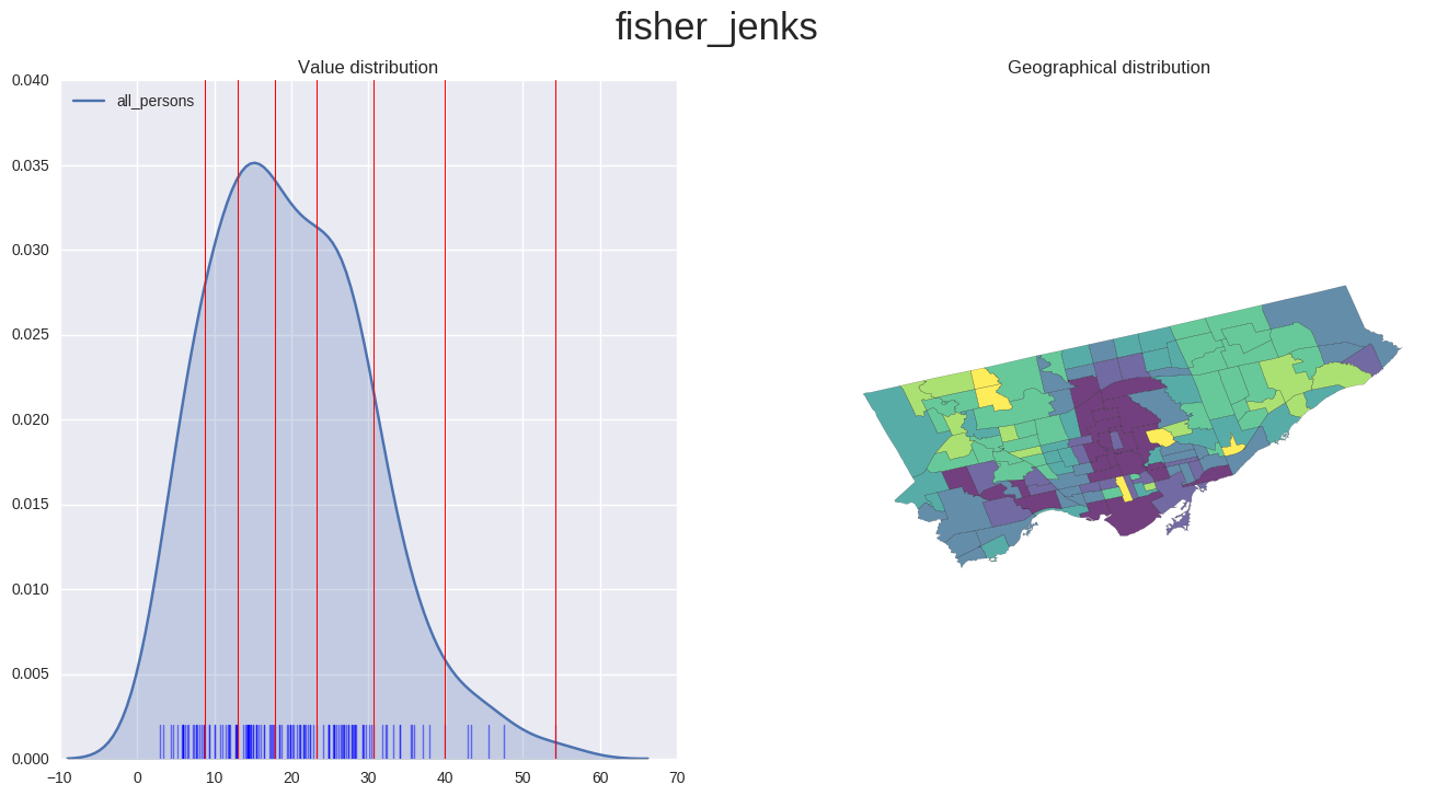
Choropleth of EDR for all persons
- Lighter colours signify a higher EDR.
plot_scheme('fisher_jenks', 'all_persons', map_data)
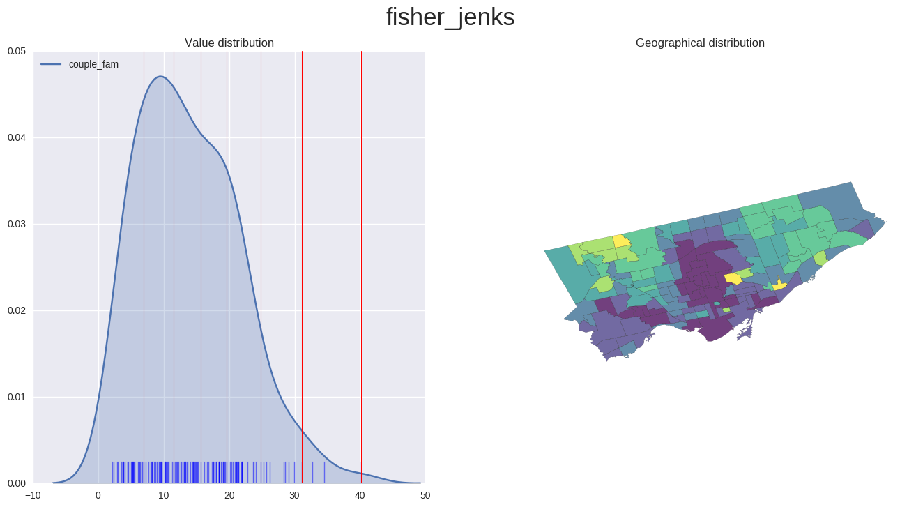
Choropleth of EDR for couple families
plot_scheme('fisher_jenks', 'couple_fam', map_data)
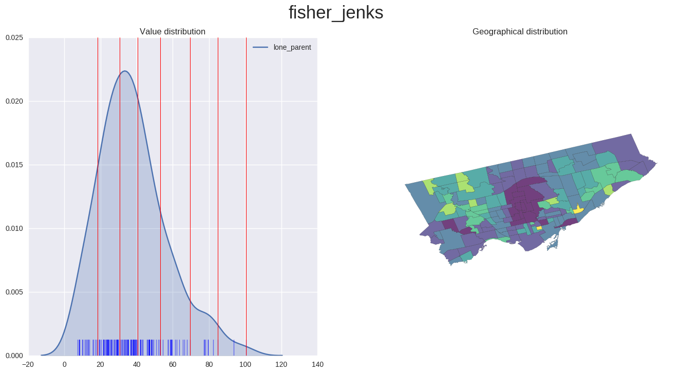
Choropleth of EDR for lone parent families
- important to note the EDR scale on the x-axis of the values distribution. These values are significantly higher than those seen in the previous plot for couple families.
- The colour scheme is re-adjusted for each plot, so the colour intensities are not comparable between the previous plot and this one.
plot_scheme('fisher_jenks', 'lone_parent', map_data)
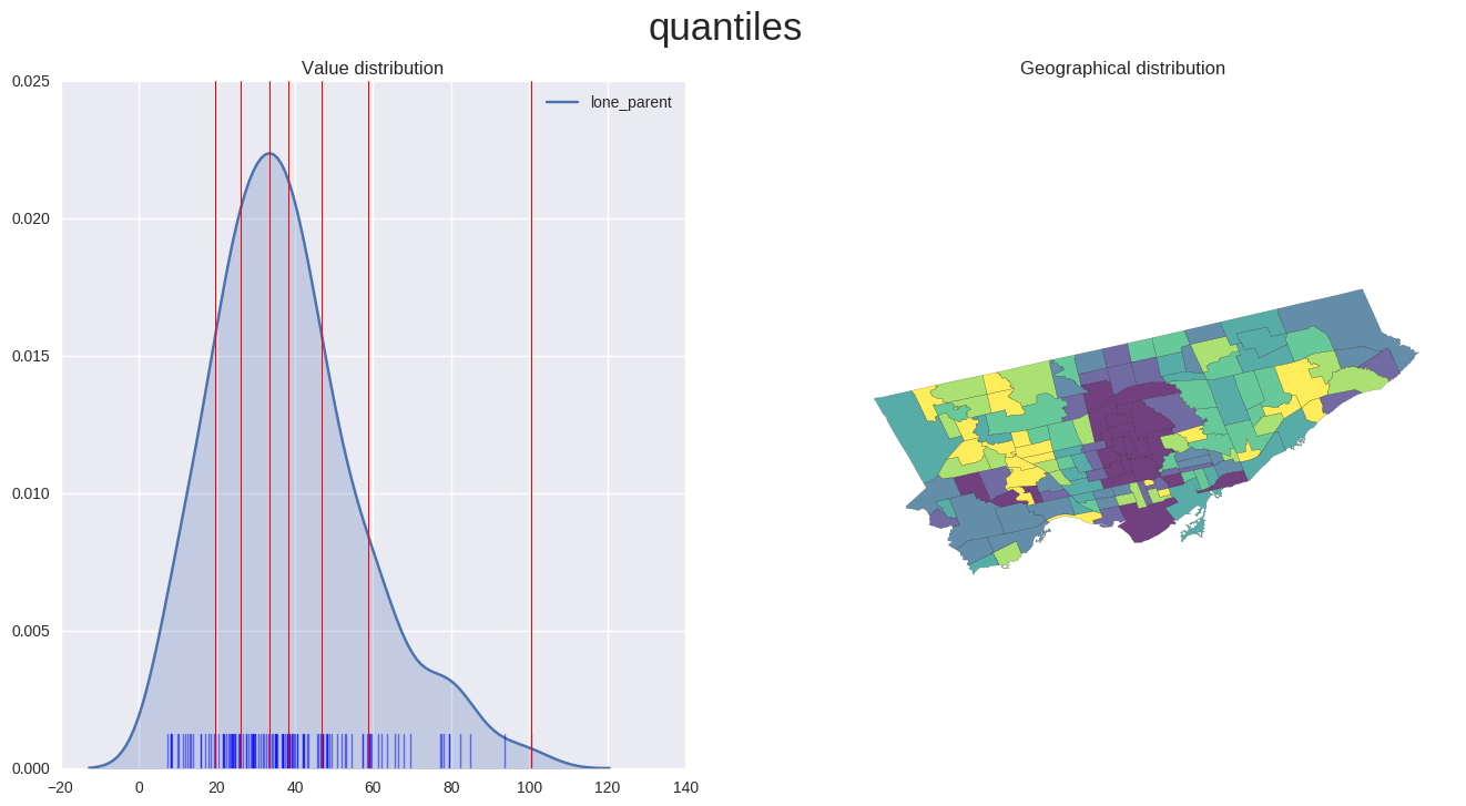
Using a different classification scheme
- The following map is using the exact same subset of data as the previous one, yet produces a choropleth with distinctly different classifications.
- Here the neighbourhoods are classified into quantiles of equal size, as opposed to using the fisher_jenks classification scheme which attempts to minimize intra-class differences while maximizing inter-class differences.
- Hopefully this provides a good example of how the choice of different classification schemes can affect the final output and thus interpretation and understanding the plotted information. The distribution of the values used can simplify/skew the original information used in unintended ways, so exploration and the combination with a density plot helps mitigate these issues.
plot_scheme('quantiles', 'lone_parent', map_data)
Overall the TPL hackathon was very interesting! If I were to keep exploring this data I would want to figure out what factors lead to such a high EDR in the Bay st corridor, which is typically thought of as a neighbourhood with higher earning individuals who would not receive so many government transfer payments.